Exhibition Review: Four Saints in Three Acts

The programme of this year has included different exhibitions, I found interesting, for the theme and the disposal, the photography exhibition, Four Saints in Three Acts at the Photographer’s Gallery. The first exhibition is focusing on the photographic dimension of the American modernist opera by way of series of rare luminaries photographers such as Lee Miller, Carl Van Vechten, George Platt Lynes and Therese Bonney. 4 Saints in 3 Acts was written by Gertrude Stein, the influential modernist writer and critic, with composition by composer and critic Virgil Thomson. Unusually for the time, the opera featured an all-black cast, made up of performers from the so-called Harlem Renaissance, including the famous Eva Jessye Choir, led by important figure Eva Jessye.

The Photographers’ Gallery in London opened in 1971 by Sue Davies was the UK’s first independent gallery devoted to photography. Their goal has always been to provide an international narrative through photography and to debate new way of thinking about the role of the photographic image in society today.

The number of documents, letters, original programmes, tickets and official photographs of the lavish stage sets, where provided by the Broadway Theatre billboard to give a more detailed profile of the movement. I found the exhibition well illustrated and explanatory; all the documents were giving more and more about the artist and their ideals. The conceptual process was reflecting the disposition of the spaces, because in the first room all the documents and texts were introducing the photography display of the second room, that presents a series of photographic portraits of the cast, in the end, the third room was a listening area where the full opera soundtrack was playing out.

The curators of the gallery Patricia Allmer and John Sears, before seeing the exhibition, they explained the story of the major artists of the exhibitions presenting Ramon Amaro, lecturer in the department of Visual Cultures at Goldsmiths, University of London and Heather Agyepong a modern photographer that take inspiration from Lee Miller and Therese Bonney.

itemsfs_11696
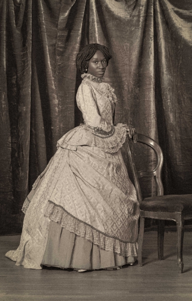
Heather Agyepong, Too Many blackamoors, 2015

For a long time, magazines, museums, galleries and art institutions have been unable or unwilling to acknowledge it or grasp its essence. “Blackness in photography has been overlooked, but that has not deterred us,” says Jamel Shabazz, a famous street photographer that gave an important contribution to the black culture.

To conclude, the Photographer’s Gallery always hosts interesting artists and Photographers from different background and style. I found the talk before the visit really important to better understand the importance of the displayed photos and deeper contextualise the black culture in the twenty century.


328f5667132e716ce7bdff7ed31714e3--harlem-renaissance-steinWhite Studio, Photograph of the stage set for Four Saints in Three Acts, 1934. © Archives/Wadsworth Atheneum Museum of Art

05_press-images-l-4-saints-in-3-acts-l-lee-miller-edwrad-matthews-as-st-ignatius-1933-e1508416809720
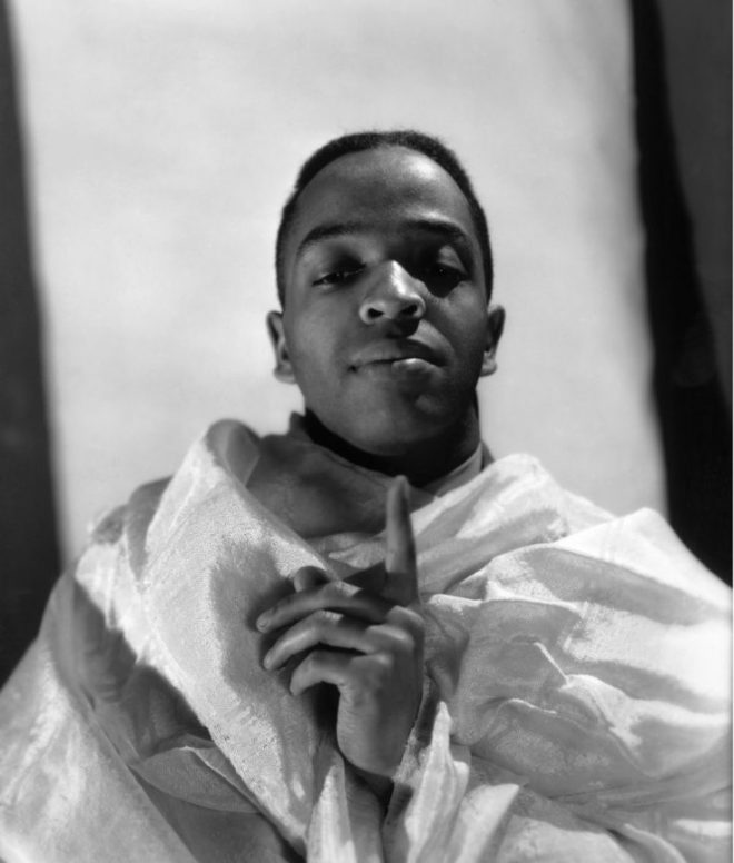
Edward Matthews as St Ignatius, Four Saints in Three Acts, New York Studio, New York, c. 1933. © Lee Miller Archives, England 2017


Bibliography:

The Photographer’s Gallery (2018) Avaible at: https://thephotographersgallery.org.uk/whats-on/talk/key-speakers-4-saints-in-3-acts(Accessed: 12/03/2018)

Joel Karamath (2018) “Saints and Sinners: Revisiting Four Saints in Three Acts” Avaible at: https://thephotographersgalleryblog.org.uk/2018/01/15/saints-sinners-revisiting-four-saints-in-3-acts/ (Accessed: 12/03/2018)

Lucia De Stefani (2016) “Addressing the Representation of Black Culture in Photography” Avaible at: http://time.com/4323138/addressing-the-representation-of-black-culture-in-photography/ (Accessed: 12/03/2018)

Architecture and Art in Collaboration

Art and Architecture since the begun of both, they have always worked together. The ambient of an exhibition is essential as the exhibition itself. Museums are technically designed to contain and expose a piece of art, but museums focus on different art fields and historical periods.

圖片0

For example one of the most outstanding architecture works is the German Pavilion,”Pavellón Mies” built by Van Der Rohe in Barcelona for the International Exposition in 1929. The Pavillon was the perfect space for a small collection of interior design, by the Modern movement Bauhaus, now the Barcelona Chair is considered a landmark in 20th-century design.

Wolsey_Angels_c_Victoria_and_Albert_Museum_London_8

Another example is the V&A, at first called the South Kensington Museum, 1857; then it was renamed the Victoria and Albert Museum in 1899 when Queen Victoria laid the foundation stone of new buildings along Exhibition Road and Cromwell Road. It contains a vast number of different kinds of art pieces from many places on earth, but it does not include modern art or painting because space has been designed to insert big statue and showcase for smaller objects.

44F4A42D00000578-0-image-m-53_1506955975985

The third kind example is the Tate Modern, the symbol of modern art in London, built in two phases between 1947 and 1963, was designed by Sir Giles Gilbert Scott. It consisted of a stunning turbine hall, 35 metres high and 152 metres long. Since 1981, the space is been transformed unused until the museum is been designed , since it opened in May 2000, more than 40 million people have visited Tate Modern. It is one of the UK’s top three tourist attractions and generates an estimated £100 million in economic benefits to London annually. The space is thought for an art that needs light and space, the monumental dimension of the turbine hall permit to the artist to give no limits of space to his art.

interior1

Tate Modern is a remarkable combination of old and new. Bankside Power station was built in two phases between 1947 and 1963. It was designed by the architect Sir Giles Gilbert Scott, who also designed Battersea Power Station and Waterloo Bridge. Constructed of a brick shell supported by an interior steel structure, its striking monumental design with its single central chimney, had often led it to be referred to as an industrial cathedral.

I have been really interested about spaces as old house and abandoned church, that were used as exhibition spaces, the atmosphere was incredibly immersive, most of the event of this kind are about new methods of made art as, interactive art, immersive art, fine art and performance art.

To conclude, every museum has his own kind of architecture for a reason, and this reason is to get the best display for art pieces. Architects and artists have always collaborate to create spaces perfectly designed. Time ago, artist as Michelangelo or Da Vinci were also the architects of palace now become museums for their art pieces.


Bibliography:

The Educational Role of the Museum, Eilean Hooper-Greenhill, Routledge, 1999

Tate Modern website,

V&A web site


Material Culture and Curators

In the second lesson with Exhibition Studies we have been asked to answer three questions, what is material culture? What is curation? What does curation do?

After asking those questions, Nela, our tutor, told us to split into groups and create an exhibition just using our imagination, paper and pencil. After understand how an exhibition works, we explore the key part of it. Material culture is any objects that are been created in the past, and now it refers to that period so it represents the culture of that time. We can also say that material culture is the physical aspect of culture. Unesco describes material culture as the study of creation, use, meanings and interpretations of the human endeavour.

There are difference exposition of different object and art; curate an exhibition has five targets, promote the approach between people and contemporary art, analyse design and trim methods, get a knowledge of the different workplace in museums, compare ideas with students to always get different views and has also to know and study lighting to create the right exhibition. the target of an exhibition curator is to create the best stage for every object. In an exhibition, the meaning of an object depends on its context, the biographies of the object is what it makes it a piece of museum (Risaliti S. 2004).

Martian-Museum-Terrestrial-art-Barbican-London-contemporary-design-exhibition-gallery-Jamie-Fobert-Architects-1-785x523
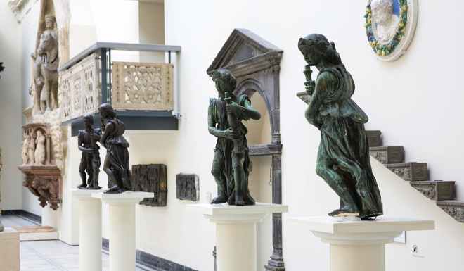
‘Martian Museum of Terrestrial Art’ at the Barbican Art Gallery

Visual culture is the other face of art together with material culture, material culture is based on objects that in a past where common uses, instead visual culture is more linked to the technology revolution that has spread in every field nowadays. First, we need to understand the difference between visual studies and visual culture, visual studies is the study of visual culture, visual culture is everything that has a visual impact on people, like a painting, publicity, photography, etc… The study of art history is part of the huge world of visual culture where they study the technique, practice, style of artists, together with the aesthetic that is the philosophical face of art (Material Culture Analysis, 2012).

Image property of the Albright-Knox Art Gallery, Buffalo, NY.Convergence, 1952 by Jackson Pollock

The context is what changes the signifier of an object so, depending on what the exhibition is about, everything could be a piece of art, for example, a masterpiece of modern art like a paint by Jackson Pollock if exhibit in the Imperial War Museum will be out of context and probably the visitors of the museum will not appreciate it. Everything has its place and is usually a risk change it, but artists like Duchamp and Dali, take those risks, most famous examples are “the fountain” by Duchamp that was a simple urinal in a different position and place, or like the”lobster phone” by Dali that was so weird for that time that could change context easily.

In conclusion, behind exhibitions, there are many persons working on it, also there are many artists not accepted in the exhibition that have submitted their work. I believe that every piece of art has his place somewhere, in some museums, it is just really difficult to find the right exhibition at the right time.


Bibliography:

Risaliti S. (2004) Eco e Narciso, culture material/art, Mondadori Electa

Material Culture Analysis (2012), Andrew j. Viduka, Unesco Bangkok Thailand, Available at: http://www.unesco.org

, William J.T. Mitchell (1995) Picture Theory, Chicago: T.H.E. University of Chicago Press

Design Thinking

The design is a tangled process built to achieve a better realization of an object or a product. Design thinking is a problem-solving way to think about design, it is a method to solve problems and satisfy as much as possible the client.

When your goal is to realize something that will solve a problem, or will change the way of how we act, everyone should start from discovering and watch what is around, what people need and what the society needs

Design Thinking anchorage people to explore alternative and create options that never exist before. Design thinking is successful because does focus on the needs of the user, it is about understanding the context and the culture to create something that integrates as best. Using direct observation and qualitative data you can produce stories that people can really empathize with or object that people really need.

tumblr_mbfzvkTYbL1rr5swxo1_400

In his 1969 seminal text on design methods, “The Sciences of the Artificial,” Nobel Prize laureate Herbert Simon outlined one of the first formal models of the Design Thinking process. The model ideate by Simon consists of seven major stages, each with component stages and activities, and was largely influential in shaping some of the most widely used Design Thinking process models today. Many are the variants of the Design Thinking process in use today, and while they may have different numbers of stages ranging from three to seven, they are all based upon the same principles featured in Simon’s 1969 model.

5808b55608af6

This method is based on a simple process to follow, it starts with learning from people colled empathise phase, second is find patterns or define to better understand what the society or the client wants, then it goes on apply the design principles so that is the ideate part that makes tangible the idea that comes out from all the information picked up before, to conclude with iterate relentlessly that’s prototype and testing.

Unfortunately, I believe that this useful method is not used as much as it should be and many designers, more than what we think, they still don’t know or don’t understand the design thinking method, is also true that this method isn’t working for any kind of design. Design Thinking is actually less about thinking and more about doing. It is not something you have, it is something you do. With digital development life cycles moving faster than ever, it’s incredibly important to put an emphasis on output.

DTK_logo_02

In conclusion, the method used to acchive a final object that it is useful and well thought, the designer has to proceed with a method that could be the Design thinking method or has to follow what the research gives to then proceed in a personal way creating something original that anyway has to have a fundamental rigour. there are no rules to be a designer or a creative but is always better find a method that gives you a guide rail to follow.


http://www.interaction-design.org

www. daylight.com

Herbert Simon, Sciences of the Artificial (3rd Edition), 1996

Gerd Waloszek, Introduction to Design Thinking, 2012

http://www.zurb.com


Design Fundamentals

During the CTS lesson, we discuss how thinking deeply in design is important to create something useful as much as possible. We analyze a framework where design is composed of affordances, mapping, conceptual models, constraints, feedback, and signifiers.

With affordances, we define the physical quality of an object that suggests to a human being the proper action to use it correctly. Every object has its affordances, also surfaces, event, and location; for example, a flat surface has the affordance of walk on it, a vertical surface has the affordance of obstructing a movement. If the affordance is high-ranking, more automatic and intuitive will be the use of the device. For example, the aspect of a handle should give information to the user of how the door open: pull it, push it or slide it ( an automatic door has a very low affordance because is not an intuitive use).

Mapping is understood where things like button, lever, or anything also used to interact with the object, needs to be. Like an affordance, mapping right is really important to give an object an intuitive way of how it works. For example, the light’s switch in a room, to be well mapped is usually near the entrance door and not in the middle of the room, another good example is the English plug that has a switch next to it to turn it on and off.

A conceptual model is a representation of a system, made of the composition of concepts which are used to help people know, understand, or simulate a subject that the model represents.

With constraints, in design, we define the limits and what you can do with an object; many objects can be used in a different way from what they were designed for, for example, the use of a gun is to shoot but can also be used as a hummer if you like to.

Feedback is also really important to let understand the user if is doing everything correctly and important to let understand if the object is actually working. We always wait for a feedback on everything we use, for example when we click a button on a computer we don’t know if we have it done correctly until the slot gives a response to our action.

Another example of feedback that really interested me is the acoustic feedback which occurs when an audio input, like a microphone, gets close to an audio output, like a speaker; it results in a loop created by the audio signal that is repeated by both the devices endlessly. Although this effect can be annoying it shows that bought the devices are actually receiving and emitting an audio signal and therefore there are working properly.

The signifier is the meaning of a thing while the signified is the meaning that we give to that object, for example, the signified of a green traffic light is to move.

All this property are fundamentals to create a good design even if sometimes they seem to be forgotten.

The Wellcome Collection

The last exhibition exposed at the Wellcome Collection in Euston it was very interesting, everything was really well explained and I have found, that also the showcase and all the space around was matching perfectly the exposition. Was all about the relationship between graphic design and healthcare, showing how the publicity can explain to the people and protect them.

Entering the gallery the first piece exposed was a big green cross that was introduced as one of the pharmacy symbols in Europe in the early 1900s. In 1864 the symbol was red and it remains in wide use throughout Europe, although many different countries used a variation of it. Today we use an electronic one and every city can decide what to put on the cross remaining always a recognizable icon to signalize a pharmacy.

Smoking is Slow Motion Suicide

The part of the exposition that has attracted me most was the graphics piece against smoking. An old cartoon was running during all the time Made by Halas & Batchelor. Produced by the Central Office of Information for the Ministry of Health; “Dying for a smoke” from 1967, in the cartoon the devil is trying to convince kid smoking but at the end, the kids see how dangerous is a cigarette and they decide to don’t smoke anymore but do sports that a smoker can’t do for more than 10 mins. Like the cartoon from Halas and Batchelor, many others cartoon has been made against smoking.  One of my favorites is from Walt Disney wit Goofy in “No Smoking” 1951, at first, it looks me weird that Walt Disney was doing cartoons about smoking but we can not forget that in that period smoking was more tolerate that today. They narrate the story of smoking showing how dependently is and how easy can spread between people, we see goofy interpret Cristoforo Colombo to show how the new world has contaminated the people with smoke.

Very rare and interesting were the stamps with publicity against smoking on it, made by artists from every country, it did attract me because were from all over the word and it looks like that smoking was bringing death everywhere.

Another really well-made project exposed was the Mosquito Killer Billboard, created by the agencies Posterscope and NBS, in 2016, emits carbon dioxide and a lactic acid solution to mimic human breathing and sweat. Mosquitos that are lured to the billboard become trapped inside, and eventually die. It is been made to solve or at least decrease the huge problem in Brazil against the Zika virus that since 2015 has conditioned 1.5 million life in Brazil; a condition that causes babies to be born with abnormally small heads. They say the billboard is designed to attract the Aedes aegypti mosquito, the species that has been found to transmit Zika, and that it can lure the insects within a radius of up to 2.5 kilometers (about 1.6 miles).

To conclude, the Wellcome Collection contains fantastic piece from professionals and students, creating a space full of interesting ideas where visive art collaborate with all day utility.


Art Activism

The relationship between art and political activism has a long story. My point of view focuses on different artists that in this years did performance and peace with a denouncing political meaning. This is not programmed art, either commissioned art, but they represent the willingness of hit a political ideology with art.
I can’t avoid quoting the Biennale of Istanbul (2011) or the Biennale of Berlin (2012) dedicated to the relationship between art and politics. Artists in Istambul were focusing on artworks that are both formally innovative and politically outspoken. It takes as its point of departure the work of the Cuban American artist Felix Gonzalez-Torres (1957–1996). Gonzalez-Torres was deeply attuned to both the personal and the political, and also rigorously attentive to the formal aspects of artistic production, integrating high modernist, minimal, and conceptual references with themes of everyday life.
The 7th Berlin Biennale had an impact on district politics and the landscape of the city; besides was hosting many activists artist, the ticket was free to everyone.

One of the artists that I have been researching on is Ai Weiwei; also his is a political activist artist, as an activist, he calls attention to human rights violations on an epic scale; as an artist, he expands the definition of art to include new forms of social engagement. In a country where free speech is not recognised as a right, the police have beaten him up, kept him under house arrest, bulldozed his newly built studio and subjected him to surveillance. He is viewed as a threat to “harmonious society.”

A-120-3
A-120-3

Study of Perspective Tiananmen Square (1995)

Also known as the “Gate of Heavenly Peace”, and formerly the front entrance to the Forbidden City, this was also the site of the brutal massacre in 1989 in which state soldiers shot peaceful protesters. The Beijing government still refuses to discuss it, and censors all footage of the event.


Bibliography:

http://12b.iksv.org

http://www.theartstory.org

A. Weiwei, Ai Weiwei: Sunflower Seeds, 2010

National Gallery CTS

The National Gallery is one of the most important galleries in London because it hosts painting from the 15th century like Leonardo Da Vinci or Piero Della Francesca to the 18/19th-century artist like Georges Seurat and Vincent Van Gogh. We once went with all the CTS class to do a visual exercise that it was finding two painting with female nude and understand what the painters were trying to communicate.

1200px-Piero,_battesimo_di_cristo_04
Before starting the research of a beautiful and full of meaning woman I went in the more classic part of the gallery, where I could admire the beautifulness of “The Baptism of Christ” (Piero Della Francesca, 1450). Since I was 12 years old this paint was always one of the covers of the Art History Books and seen it in front of me it was an experience; further to Piero Della Francesca, “The Virgin Of The Rocks” (Leonardo Da Vinci, 1506) and “Venus and Mars” (Sandro Botticelli, 1485).
For the CTS exercise, we had just to peak up a piece from the 18th century onwards, so the majority of the possibilities of choice where gone. In the 19th century, art movements (loose associations of artists working in a similar style) emerged, as did the idea of the independent artist who rebelled against the official art establishment, so also the view of a nude in painting changed.

-fronts-N-6359-00-000027-WZ-PYR
One of the two painting that I chose was “Bathers (Les Grandes Baigneuses)” (Paul Cézanne, 1905). Cézanne was reinterpreting a long tradition of paintings with nude figures in the landscape by artists such as Titian and Poussin. While the subjects of their works were taken from classical myths, Cézanne did not use direct literary sources. Instead, his central theme was the harmony of the figures with the landscape expressed through solid forms, strict architectonic structure, and the earth tones of the bodies.

Bibliography:

http://www.nationalgallery.org.uk


Sustainable Design

CTS lessons are often about recycling or pollution, any times we change point of view to see the same thing, sustainable design it is been one of the most interesting lessons in my opinion.

Eco-sustainable Design is getting every year more and more important for people, but getting a significant goal is always so hard.
The principal objectives of sustainability are to reduce consumption of non-renewable resources, minimise waste, and create healthy, productive environments.
Many are the ideas of making product design in an eco-sustainable way, but using cardboard to make any furniture is an admirable idea. It can look difficult create a chair in cardboard but is actually easy; with the help of programmes like Autodesk 123DMake, everyone can create his own design in cardboard with some simple process.

Projects like the Warka Water Tower by Arturo Vittori or the Moscardino by Giulio Iacchetti are helping people and the environment proceeding with simple ideas that really change the situation.

movie-warka-water-future-makers-sustainability-video_dezeen_2364_col_3

movie-warka-water-future-makers-sustainability-video_dezeen_1702_02
The water tower consists of a bamboo frame supporting a mesh polyester material inside. Rain, fog and dew condense against the mesh and trickles down a funnel into a reservoir at the base of the structure. A fabric canopy shades the lower sections of the tower to prevent the collected water from evaporating.

moscardino-PANDORA-01-600x777

Moscardino is a multi-use cutlery made in a recycling material (Mater-bi) useful to eat a fast, informal meal, without making any waste.

Design even been a culprit of a relative part of the pollution in the world is also the answer to a green future. The history of sustainability is a relatively young one. At the In 1987 the UN Environment Commission, chaired by Gro Harlem Brundtland, defined sustainable development as: “development that meets the needs of the present without compromising the ability of future generations to respond to their needs”.


Bibliography

http://www.giulioiacchetti.com

Moodle arts

GSA (2016). Sustainable Design. Available at https://www.gsa.gov/portal/content/104462.

Semiotics point of view

Semiotic is a general science of symbols, of their production, transmission, interpretation and how we communicate through an object or an image. Semiotic is the discipline that studies the phenomenon of meaning. For meaning, we mean the relation between something physically present and something absent for example the red traffic light mean “stop”; every time we activate a communication process ( the light is red, so I stop the car ).
The underlying argument behind the semiotic approach is that since all cultural objects convey meaning, and all cultural practice depend on the purpose, they must make use of signs.; and as they do, signs must work like language and words. Therefore, signs must be able to be interpreted and analysed.
The definition of the relation between sign and semiotic of Pierce take place with three elements: Representamen, the physics part; the object, a referent where the sign is referring; the interpreted, what comes from the sign or generate the sign.
Despite different approach used by various semiologist, it is possible to say that the Greimas theory collects all the agreement parts of most theories. What is unanimously accepted is that to analyse a paint we need to concentrate on the expression of the image, understand for which reason the piece it has been made: conversational, for religious purpose or express something political so that you can adopt the suitable strategy.
All the text in a painting is a carrier of a semiotic meaning, the semiotic in painting study the hidden marks and its significance.

6
The sign is the relation that includes signifier and signified; the signifier is a concept, an idea, an expression of something ( of a material object, of a living thing, of an action, etc. ) that materialise through the signified that does exist as the bearer of meaning.

Bibliography

Wk 3 semiotic CTS, Moodle

Umberto E., A Theory Of Semiotics, 1975